Milo - KNN based differential abundance analysis#
This notebook demonstrates how to run differential abundance analysis on single-cell datasets using the Milo framework [DHT+22].
Many biological conditions (disease, development, genetic KOs) can induce shifts in cell composition, where cells of a given state become enriched or depleted in response to a perturbation. With differential abundance analysis, we quantify consistent changes in cell composition across replicate samples. While differential abundance analysis can be performed on cell type clusters, it’s not always possible or practical to use precisely labeled clusters, especially when we are interested in studying transitional states, such as during developmental processes, or when we expect only a subpopulation of a cell type to be affected by the condition of interest. Milo is a method to detect compositional changes occurring in smaller subpopulations of cells, defined as neighbourhoods over the k-nearest neighbor (KNN) graph of cell-cell similarities.
Setup#
Note: You need either pertpy installed with the “de” extra (pip install pertpy[de]) or the individual R packages edger, statmod, and rpy2.
If you did not install the R packages, you must work with the pydeseq2 solver as used in this tutorial.
Please check the installation documentation for details.
import warnings

import matplotlib
import matplotlib.pyplot as plt
import numpy as np
import pertpy as pt
import scanpy as sc

warnings.filterwarnings("ignore")
plt.rcParams["figure.figsize"] = (7, 7)
Dataset#
For this vignette we will use a dataset of blood cells from COVID-19 patients - the Stephenson et al. 2021 dataset. The original dataset is available via cellxgene. Here cells were subsampled to have 500 cells per donor, and predicted doublets and low quality cells were filtered out.
adata = pt.dt.stephenson_2021_subsampled()
This object collects data from PBMCs of 119 individuals (adata.obs['patient_id']), with varying severity of COVID-19 |(adata.obs['Status_on_day_collection_summary']). Samples were collected from three different hospitals (adata.obs['Site']). The dataset also includes 6 samples from PBMCs of healthy patients stimulated with LPS to simulate anti-viral response, which we will exclude in subsequent analysis.
adata.obs["COVID_severity"] = adata.obs["Status_on_day_collection_summary"].copy()  # short name
adata.obs[["patient_id", "COVID_severity"]].drop_duplicates().value_counts("COVID_severity")
COVID_severity
Moderate        30
Healthy         23
Mild            23
Critical        15
Severe          13
Asymptomatic     9
LPS_10hours      3
LPS_90mins       3
Name: count, dtype: int64
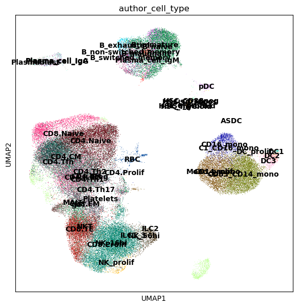
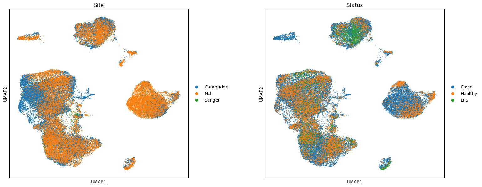
Here the data from different patients and sites has been integrated in a common latent space, minimizing the differences between donors, by mapping with scArches using an scVI model trained on healthy PBMCs (see here for references on integration). We can visualize the batch-corrected space using UMAP.
sc.pl.umap(adata, color=["author_cell_type"], legend_loc="on data")
sc.pl.umap(adata, color=["Site", "Status"], wspace=0.3, size=8)
In this dataset we are interested in identifying cell populations that increase in abundance in response to COVID-19, and with varying degrees of severity COVID-19 severity.
Prepare for Milo analysis#
## Exclude LPS samples
adata = adata[adata.obs["Status"] != "LPS"].copy()

## Initialize object for Milo analysis
milo = pt.tl.Milo()
mdata = milo.load(adata)
When initializing the Milo object, we create a MuData object which will store both the gene expression matrices (rna view) and cell count matrices used for differential abundance analysis (milo view).
mdata
MuData object with n_obs × n_vars = 59873 × 16299
  2 modalities
    rna:	59873 × 16299
      obs:	'Collection_Day', 'Swab_result', 'Status', 'Smoker', 'Status_on_day_collection', 'Status_on_day_collection_summary', 'Days_from_onset', 'Site', 'time_after_LPS', 'Worst_Clinical_Status', 'Outcome', 'patient_id', 'author_cell_type', 'organism', 'sex', 'tissue', 'ethnicity', 'disease', 'assay', 'cell_type', 'dataset_group', 'COVID_severity'
      var:	'gene_id', 'gene_name'
      uns:	'log1p', 'umap', 'author_cell_type_colors', 'Site_colors', 'Status_colors'
      obsm:	'X_scVI', 'X_umap'
    milo:	0 × 0
Build KNN graph#
We can use scanpy functions to build a KNN graph. We set the dimensionality and value for k to use in subsequent steps.
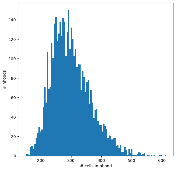
Here the value of k indicates the smallest possible size of neighbourhood in which we will quantify differential abundance (i.e. with k=50 the smallest neighbourhood will have 50 cells). Depending on the number of samples, you might want to use a high value of k for neighbourhood analysis, to have sufficient power to estimate abundance fold-changes. Since here we have data from > 100 patients, we set k=150 to have on average more than one cell per donor in each neighbourhood.
sc.pp.neighbors(mdata["rna"], use_rep="X_scVI", n_neighbors=150)
Construct neighbourhoods#
This step assigns cells to a set of representative neighbourhoods on the KNN graph.
milo.make_nhoods(mdata["rna"], prop=0.1)
The assignment of cells to neighbourhoods is stored as a sparse binary matrix in mdata['rna'].obsm. Here we see that cells have been assigned to 4307 neighbourhoods.
mdata["rna"].obsm["nhoods"]
<Compressed Sparse Row sparse matrix of dtype 'float32'
	with 1291384 stored elements and shape (59873, 4307)>
The information on which cells are sampled as index cells of representative neighbourhoods is stored in mdata['rna'].obs, along with the distance of the index to the kth nearest neighbor, which is used later for the SpatialFDR correction.
mdata["rna"][mdata["rna"].obs["nhood_ixs_refined"] != 0].obs[["nhood_ixs_refined", "nhood_kth_distance"]]
| nhood_ixs_refined | nhood_kth_distance | |
|---|---|---|
| 10_1038_s41591_021_01329_2-S12_CTGTGCTAGCTCCTCT-1 | 1 | 0.971570 |
| 10_1038_s41591_021_01329_2-S11_TAAGCGTAGATCGGGT-1 | 1 | 1.470872 |
| 10_1038_s41591_021_01329_2-S12_CTTCTCTAGGCAGGTT-1 | 1 | 0.825768 |
| 10_1038_s41591_021_01329_2-S11_ACGGAGACACCGAAAG-1 | 1 | 1.442517 |
| 10_1038_s41591_021_01329_2-S12_AACCATGGTCCATCCT-1 | 1 | 0.754144 |
| ... | ... | ... |
| 10_1038_s41591_021_01329_2-GGGCATCGTGTCAATC-newcastle74 | 1 | 0.877502 |
| 10_1038_s41591_021_01329_2-TGCACCTGTCAAAGCG-newcastle74 | 1 | 1.206315 |
| 10_1038_s41591_021_01329_2-ATTTCTGCATGAAGTA-newcastle74 | 1 | 0.904630 |
| 10_1038_s41591_021_01329_2-GTCGTAATCTCGAGTA-newcastle74 | 1 | 1.094851 |
| 10_1038_s41591_021_01329_2-TTCGGTCAGGGCTTCC-newcastle74 | 1 | 0.840913 |
4307 rows × 2 columns
We can visualize the distribution of neighbourhood sizes, to check that the minimal value of k makes sense, and that the distribution of sizes is not too wide.
nhood_size = np.array(mdata["rna"].obsm["nhoods"].sum(0)).ravel()
plt.hist(nhood_size, bins=100)
plt.xlabel("# cells in nhood")
plt.ylabel("# nhoods");
Count cells in neighbourhoods#
Milo leverages the variation in cell numbers between replicates for the same experimental condition to test for differential abundance. Therefore we have to count how many cells from each sample (in this case the patient) are in each neighbourhood. We need to use the cell metadata saved in adata.obs and specify which column contains the sample information.
mdata = milo.count_nhoods(mdata, sample_col="patient_id")
This function populates the modality milo to mdata.
mdata[‘milo’] is an anndata object where obs correspond to samples and vars correspond to neighbourhoods, and where .X stores the number of cells from each sample counted in a neighbourhood. This count matrix will be used for DA testing.
mdata
MuData object with n_obs × n_vars = 59873 × 16299
  2 modalities
    rna:	59873 × 16299
      obs:	'Collection_Day', 'Swab_result', 'Status', 'Smoker', 'Status_on_day_collection', 'Status_on_day_collection_summary', 'Days_from_onset', 'Site', 'time_after_LPS', 'Worst_Clinical_Status', 'Outcome', 'patient_id', 'author_cell_type', 'organism', 'sex', 'tissue', 'ethnicity', 'disease', 'assay', 'cell_type', 'dataset_group', 'COVID_severity', 'nhood_ixs_random', 'nhood_ixs_refined', 'nhood_kth_distance'
      var:	'gene_id', 'gene_name'
      uns:	'log1p', 'umap', 'author_cell_type_colors', 'Site_colors', 'Status_colors', 'neighbors', 'nhood_neighbors_key'
      obsm:	'X_scVI', 'X_umap', 'nhoods'
      obsp:	'distances', 'connectivities'
    milo:	113 × 4307
      var:	'index_cell', 'kth_distance'
uns: 'sample_col'mdata["milo"]
AnnData object with n_obs × n_vars = 113 × 4307
    var: 'index_cell', 'kth_distance'
    uns: 'sample_col'
Differential abundance testing with GLM#
We are now ready to test for differential abundance in time. The experimental design needs to be specified with R-style formulas.
Here we run a simple comparison, testing for changes in cell abundance associated with COVID-19.
# Reorder categories (by default, the last category is taken as the condition of interest)
mdata["rna"].obs["Status"] = mdata["rna"].obs["Status"].cat.reorder_categories(["Healthy", "Covid"])
milo.da_nhoods(mdata, design="~Status", solver="edger")
We can explicitly specify the comparison we want to make using the parameter model_contrasts. This is especially important when we have more than two levels for a category and we want to compare against a specific control level.
Note that Milo supports two different solvers:
“edger” which requires the edger package to be available in conjunction with rpy2. This solver is the closest to the original R implementation.
“pydeseq2” which requires the pydeseq2 package to be available. The pydeseq2 solver is very close to the edger solver albeit a bit slower. However, it does not require R packages to be installed making it easier to use.
We can take potential confounders into account that could affect cell abundances such as batch effects by including them in the model using the syntax ~ confounders + condition, where the covariate specified in the last term is always the covariate of interest.
In this case we estimate the effect of COVID-19 on cell abundance regressing out changes in cell abundance driven by the site of collection.
See below for more examples on how to specify different types of comparisons.
# If we wanted to only contrast Covid vs Healthy
# milo.da_nhoods(mdata, design="~Status", model_contrasts="StatusCovid-StatusHealthy", solver="pydeseq2")

# Taking Site and Status into account
milo.da_nhoods(mdata, design="~Site+Status", model_contrasts="StatusCovid", solver="pydeseq2")
Information about the sample design is stored in mdata['milo'].obs:
mdata["milo"].obs
| Site | Status | patient_id | |
|---|---|---|---|
| AP1 | Sanger | Covid | AP1 |
| AP2 | Sanger | Covid | AP2 |
| AP3 | Sanger | Covid | AP3 |
| AP4 | Sanger | Covid | AP4 |
| AP5 | Sanger | Covid | AP5 |
| ... | ... | ... | ... |
| newcastle21v2 | Ncl | Covid | newcastle21v2 |
| newcastle49 | Ncl | Covid | newcastle49 |
| newcastle59 | Ncl | Covid | newcastle59 |
| newcastle65 | Ncl | Healthy | newcastle65 |
| newcastle74 | Ncl | Healthy | newcastle74 |
113 rows × 3 columns
The differential abundance test results are stored in milo_mdata['milo'].var. In particular:
logFC: stores the log-Fold Change in abundance (i.e. the slope of the linear model)PValuestores the p-value for the testSpatialFDRstores the p-values adjusted for multiple testing (accounting for overlap between neighbourhoods)
mdata["milo"].var
| index_cell | kth_distance | F | adjust.method | comparison | test | SpatialFDR | logCPM | logFC | PValue | FDR | |
|---|---|---|---|---|---|---|---|---|---|---|---|
| 0 | 10_1038_s41591_021_01329_2-S12_CTGTGCTAGCTCCTCT-1 | 0.971570 | 0.631961 | BH | StatusCovid | glm | 0.642661 | 2.202746 | -0.294298 | 0.396894 | 0.624104 |
| 1 | 10_1038_s41591_021_01329_2-S11_TAAGCGTAGATCGGGT-1 | 1.470872 | 0.149640 | BH | StatusCovid | glm | 0.262379 | 2.326233 | -0.755254 | 0.087376 | 0.244209 |
| 2 | 10_1038_s41591_021_01329_2-S12_CTTCTCTAGGCAGGTT-1 | 0.825768 | 0.074671 | BH | StatusCovid | glm | 0.909438 | 2.369358 | -0.096208 | 0.806569 | 0.902778 |
| 3 | 10_1038_s41591_021_01329_2-S11_ACGGAGACACCGAAAG-1 | 1.442517 | 3.351044 | BH | StatusCovid | glm | 0.469082 | 1.957851 | 0.539951 | 0.222150 | 0.447229 |
| 4 | 10_1038_s41591_021_01329_2-S12_AACCATGGTCCATCCT-1 | 0.754144 | 0.182119 | BH | StatusCovid | glm | 0.923929 | 1.792570 | -0.076828 | 0.830549 | 0.917614 |
| ... | ... | ... | ... | ... | ... | ... | ... | ... | ... | ... | ... |
| 4302 | 10_1038_s41591_021_01329_2-GGGCATCGTGTCAATC-ne... | 0.877502 | 9.063464 | BH | StatusCovid | glm | 0.060707 | 2.745228 | -1.303197 | 0.008671 | 0.052382 |
| 4303 | 10_1038_s41591_021_01329_2-TGCACCTGTCAAAGCG-ne... | 1.206315 | 7.927434 | BH | StatusCovid | glm | 0.056522 | 2.141428 | -1.086816 | 0.007687 | 0.048545 |
| 4304 | 10_1038_s41591_021_01329_2-ATTTCTGCATGAAGTA-ne... | 0.904630 | 1.326685 | BH | StatusCovid | glm | 0.391578 | 2.226486 | -0.729487 | 0.162995 | 0.370850 |
| 4305 | 10_1038_s41591_021_01329_2-GTCGTAATCTCGAGTA-ne... | 1.094851 | 1.739645 | BH | StatusCovid | glm | 0.441291 | 2.418209 | 0.527971 | 0.200315 | 0.419529 |
| 4306 | 10_1038_s41591_021_01329_2-TTCGGTCAGGGCTTCC-ne... | 0.840913 | 2.208758 | BH | StatusCovid | glm | 0.216695 | 2.396728 | -0.933362 | 0.064348 | 0.199817 |
4307 rows × 11 columns
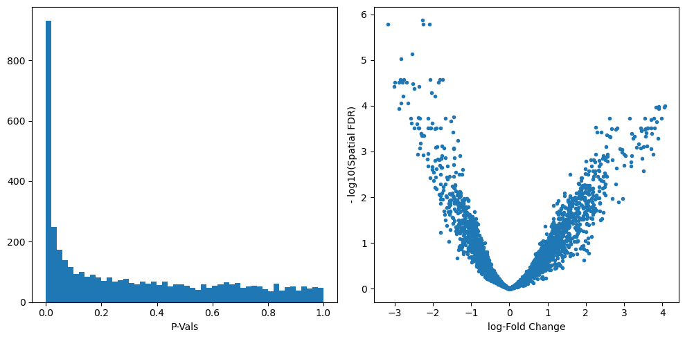
We can start inspecting the results of our DA analysis from a couple of standard diagnostic plots.
old_figsize = plt.rcParams["figure.figsize"]
plt.rcParams["figure.figsize"] = [10, 5]
plt.subplot(1, 2, 1)
plt.hist(mdata["milo"].var.PValue, bins=50)
plt.xlabel("P-Vals")
plt.subplot(1, 2, 2)
plt.plot(mdata["milo"].var.logFC, -np.log10(mdata["milo"].var.SpatialFDR), ".")
plt.xlabel("log-Fold Change")
plt.ylabel("- log10(Spatial FDR)")
plt.tight_layout()
plt.rcParams["figure.figsize"] = old_figsize
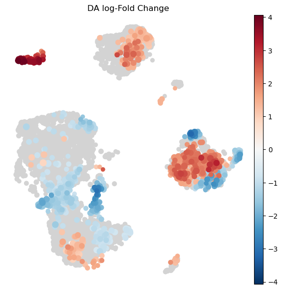
Visualize results on embedding#
To visualize DA results relating them to the embedding of single cells, we can build an abstracted graph of neighbourhoods that we can superimpose on the single-cell embedding. Here each node represents a neighbourhood, and the layout of nodes is determined by the position of the index cell in the UMAP embedding of all single-cells. The neighbourhoods displaying singificant DA are colored by their log-Fold Change.
milo.build_nhood_graph(mdata)
plt.rcParams["figure.figsize"] = [7, 7]
milo.plot_nhood_graph(
    mdata,
    padj_threshold=0.1,  # SpatialFDR level (1%)
    min_size=1,  # Size of smallest dot
)
Visualize result by celltype#
We might want to visualize whether DA is particularly evident in certain cell types. To do this, we assign a cell type label to each neighbourhood by finding the most abundant cell type within cells in each neighbourhood (after all, neighbourhoods are in most cases small subpopulations within the same cell type). We can label neighbourhoods in the results data.frame using the function milo.annotate_nhoods. This also saves the fraction of cells harbouring the label.
milo.annotate_nhoods(mdata, anno_col="author_cell_type")
We can see that for the majority of neighbourhoods, almost all cells have the same cell type label. We can rename neighbourhoods where less than 60% of the cells have the top label as “Mixed”
plt.hist(mdata["milo"].var["nhood_annotation_frac"], bins=30)
plt.xlabel("celltype fraction")
Text(0.5, 0, 'celltype fraction')
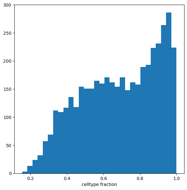
mdata["milo"].var["nhood_annotation"] = mdata["milo"].var["nhood_annotation"].cat.add_categories("Mixed")
mdata["milo"].var.loc[mdata["milo"].var["nhood_annotation_frac"] < 0.6, "nhood_annotation"] = "Mixed"
Now we can visualize the fold changes by cell type annotation.
milo.plot_da_beeswarm(mdata, padj_threshold=0.1)
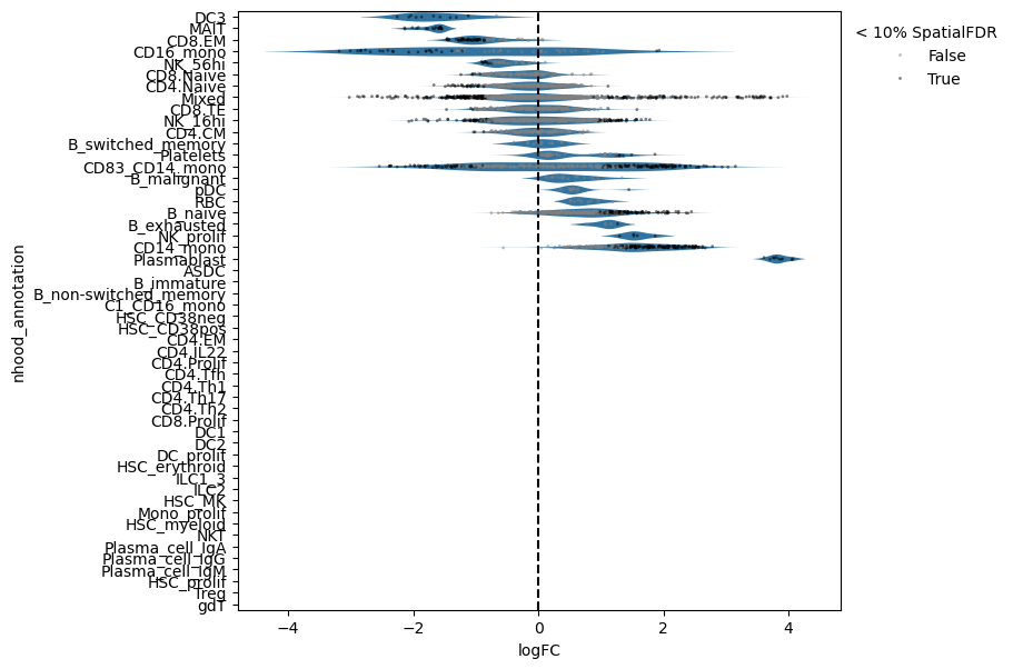
This shows that neighbourhoods of Plasmablast cells, malignant B cells and monocytes are especially enriched in cells from COVID-19 samples.
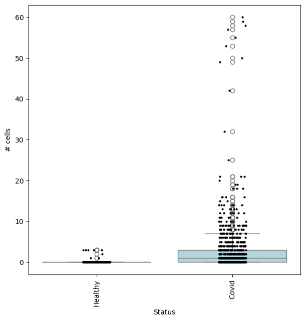
We can check the effect size by visualizing the cell counts directly
## Get IDs of plasmablast neighbourhood
pl_nhoods = mdata["milo"].var_names[
(mdata["milo"].var["SpatialFDR"] < 0.1) & (mdata["milo"].var["nhood_annotation"] == "Plasmablast")
]
## Visualize cell counts by condition (x-axis) and individuals on all neighbourhoods
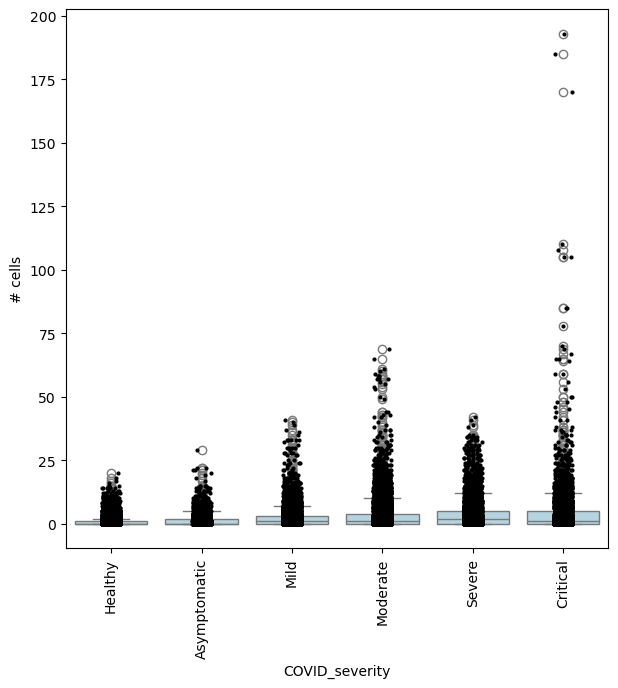
milo.plot_nhood_counts_by_cond(mdata, test_var="Status", subset_nhoods=pl_nhoods, log_counts=False)
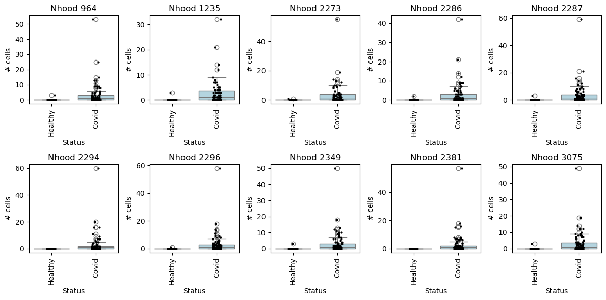
with matplotlib.rc_context({"figure.figsize": [12, 6]}):
    fig, axes = plt.subplots(2, 5, figsize=(12, 6))
    axes = axes.flatten()

    for i, nh in enumerate(pl_nhoods):
        milo.plot_nhood_counts_by_cond(
            mdata, test_var="Status", subset_nhoods=[nh], log_counts=False, ax=axes[i], show=False
        )
        axes[i].set_title(f"Nhood {nh}")

    plt.tight_layout()
Specifying DA comparisons - examples using model contrasts#
We can compute fold-changes and p-values for multiple comparisons on the same set of neighbourhoods, by specifying the test of interest in the design and model_contrasts parameter.
For example, we can find neighbourhoods enriched in cells from Asymptomatic patients, compared to healthy individuals:
severity_order = ["Healthy", "Asymptomatic", "Mild", "Moderate", "Severe", "Critical"]
mdata["rna"].obs["COVID_severity"] = mdata["rna"].obs["COVID_severity"].cat.reorder_categories(severity_order)
milo.da_nhoods(mdata, design="~Site+COVID_severity", model_contrasts="COVID_severityAsymptomatic", solver="pydeseq2")
# no need to set "-COVID_severityHealthy", since this is the reference level
## Get IDs of enriched neighbourhoods
pl_nhoods = mdata["milo"].var_names[(mdata["milo"].var["SpatialFDR"] < 0.01) & (mdata["milo"].var["logFC"] > 2)]

## Visualize cell counts by condition (x-axis) and individuals on all signif neighbourhoods
milo.plot_nhood_counts_by_cond(mdata, test_var="COVID_severity", subset_nhoods=pl_nhoods, log_counts=False)
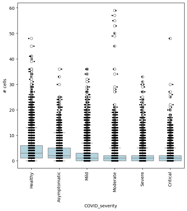
or comparing Asymptomatic patients againsts all other COVID-19 patients:
milo.da_nhoods(
    mdata,
    design="~Site+COVID_severity",
    model_contrasts="COVID_severityAsymptomatic-(COVID_severityMild + COVID_severityModerate + COVID_severitySevere + COVID_severityCritical)",
    solver="edger",  # The pydeseq2 solver does not support such complex contrasts
)
## Get IDs of enriched neighbourhoods
pl_nhoods = mdata["milo"].var_names[(mdata["milo"].var["SpatialFDR"] < 0.1) & (mdata["milo"].var["logFC"] > 2)]

## Visualize cell counts by condition (x-axis) and individuals on all signif neighbourhoods
milo.plot_nhood_counts_by_cond(mdata, test_var="COVID_severity", subset_nhoods=pl_nhoods, log_counts=False)
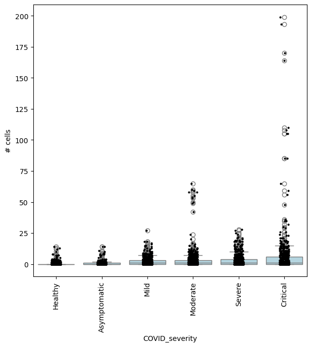
In this case, we could also be interested in finding where cell abundance increases or decreases linearly with COVID-19 severity. To do this, we need to encode COVID severity as a continuous variable.
severity_order = ["Healthy", "Asymptomatic", "Mild", "Moderate", "Severe", "Critical"]
mdata["rna"].obs["COVID_severity_continuous"] = mdata["rna"].obs["COVID_severity"].cat.codes
milo.da_nhoods(mdata, design="~Site+COVID_severity_continuous", solver="pydeseq2")
## Get IDs of enriched neighbourhoods
pl_nhoods = mdata["milo"].var_names[
    (mdata["milo"].var["SpatialFDR"] < 0.1) & (mdata["milo"].var["logFC"] > 0)
]  ## notice how here logFCs are much smaller

## Add COVID severity labels to mdata['milo'].obs
milo.add_covariate_to_nhoods_var(mdata, ["COVID_severity"])
mdata["milo"].obs["COVID_severity"] = (
    mdata["milo"].obs["COVID_severity"].astype("category").cat.reorder_categories(severity_order)
)

## Visualize cell counts by condition (x-axis) and individuals on all signif neighbourhoods
milo.plot_nhood_counts_by_cond(mdata, test_var="COVID_severity", subset_nhoods=pl_nhoods, log_counts=False)
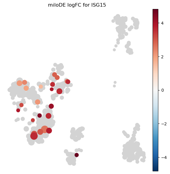
Per-neighbourhood differential expression with miloDE#
Milo.de_nhoods runs differential expression inside each neighbourhood.
For every nhood it pseudobulks cells by sample, fits the existing pertpy DE model (PyDESeq2 or Statsmodels), and corrects p-values both across genes within each nhood and across nhoods per gene (density-weighted Benjamini-Hochberg, same correction da_nhoods uses).
Unlike DA testing this requires raw counts, so we use the kang_2018 IFN-β stimulation dataset (8 patients × ctrl/stim, raw counts in .X) for this short demo.
# Load a dataset with raw counts and prepare the Milo object
adata_de = pt.dt.kang_2018()
sc.pp.subsample(adata_de, n_obs=10000, random_state=0)  # subsample for a fast demo
adata_de.layers["counts"] = adata_de.X.copy()
adata_de.obs["sample"] = adata_de.obs["replicate"].astype(str) + "_" + adata_de.obs["label"].astype(str)
sc.pp.normalize_total(adata_de)
sc.pp.log1p(adata_de)
# miloDE fits a full DESeq2 model per neighbourhood, so we restrict to highly variable genes to keep the runtime short.
sc.pp.highly_variable_genes(adata_de, n_top_genes=2000)
adata_de = adata_de[:, adata_de.var["highly_variable"]].copy()
sc.pp.pca(adata_de)
sc.pp.neighbors(adata_de, use_rep="X_pca", n_neighbors=100)
sc.tl.umap(adata_de)

milo_de = pt.tl.Milo()
mdata_de = milo_de.load(adata_de)
milo_de.make_nhoods(mdata_de["rna"], prop=0.1)
mdata_de = milo_de.count_nhoods(mdata_de, sample_col="sample")
milo_de.build_nhood_graph(mdata_de)
# Run miloDE: stim vs ctrl
# de_nhoods fits one DESeq2 model per neighbourhood, so for a fast tutorial we test a random subset.
# Increase n_test (or drop subset_nhoods) to cover more neighbourhoods at the cost of runtime.
n_test = min(60, mdata_de["milo"].n_vars)
rng = np.random.default_rng(0)
subset_nhoods = sorted(rng.choice(mdata_de["milo"].n_vars, size=n_test, replace=False).tolist())
de = milo_de.de_nhoods(
    mdata_de,
    design="~label",
    column="label",
    baseline="ctrl",
    group_to_compare="stim",
    layer="counts",
    subset_nhoods=subset_nhoods,
)
tested = int(de.groupby("nhood")["test_performed"].first().sum())
print(f"{tested} of {mdata_de['milo'].n_vars} nhoods tested")
de.loc[de["test_performed"]].sort_values("adj_p_value").head()
The result is a long DataFrame with one row per (nhood, gene): log_fc, p_value, adj_p_value (BH across genes within each nhood), pval_corrected_across_nhoods (density-weighted BH across nhoods per gene), plus a test_performed flag.
Column names match the rest of pertpy’s DE module, so the existing plot_volcano accepts a per-nhood slice directly.
# Visualize per-nhood logFC of one gene on the nhood graph.
# ISG15 is a canonical IFN-β response gene -- expect strong positive logFC in many nhoods.
milo_de.plot_de_nhood_graph(mdata_de, de, gene="ISG15", min_size=2)