Distance metrics#
Pertpy implements distance metrics between groups of single cells in the module pertpy.tl.Distance.
Here, we show a subset of the distances available in pertpy and their use cases when analysing perturbation data.
There are many ways to measure the distance between two groups of cells, sometimes referred to as ‘point cloud distance metrics’. The simplest one is the Euclidean distance between the average expression of the two groups (We call this “pseudobulk” distance). However, this distance is not very informative, as it does not take into account the variability of the expression of the individual cells or the shape of the underlying distribution.
Other implemented distance functions have different ways of incorporating the distribution of single cells into the distance calculation.
Please refer to Distance for a complete list of available distances.
Setup#
import matplotlib.pyplot as plt
import numpy as np
import pertpy as pt
import scanpy as sc
from seaborn import clustermap
Dataset#
Here, we use an example dataset, which is a subset and already preprocessed version of data from the original Perturb-seq paper (Dixit et al., 2016).
The full dataset can be accessed using pt.dt.dixit_2016().
Note that most distances are computed in PCA space to avoid the curse of dimensionality or to speed up computation.
When using your own dataset run scanpy.pp.pca first, prior to using the distance methods.
If you prefer to compute distances in a different space, specify an alternative obsm_key argument when calling the distance function.
adata = pt.dt.distance_example()
obs_key = "perturbation"  # defines groups to test
sc.pp.neighbors(adata, use_rep="X_pca", n_neighbors=30, n_pcs=30)
sc.tl.umap(adata)
sc.pl.scatter(adata, basis="umap", color=obs_key, show=True)

Looking at the UMAP, perturbations seem well-mixed, suggesting that distances between them will be small. These distance measures formalize that intuition in a higher-dimensional space.
Distances#
E-distance#
The E-distance (short for energy distance) is defined as twice the average distance between the two groups of cells minus each the average distance between the cells within each group. By this, the E-distance intuituively relates the distance between to the distance within groups. For more information on E-distance for single cell analysis, see Peidli et al., (2023).
distance = pt.tl.Distance("edistance", obsm_key="X_pca")
df = distance.pairwise(adata, groupby=obs_key)
clustermap(df, robust=True, figsize=(10, 10))
plt.show()
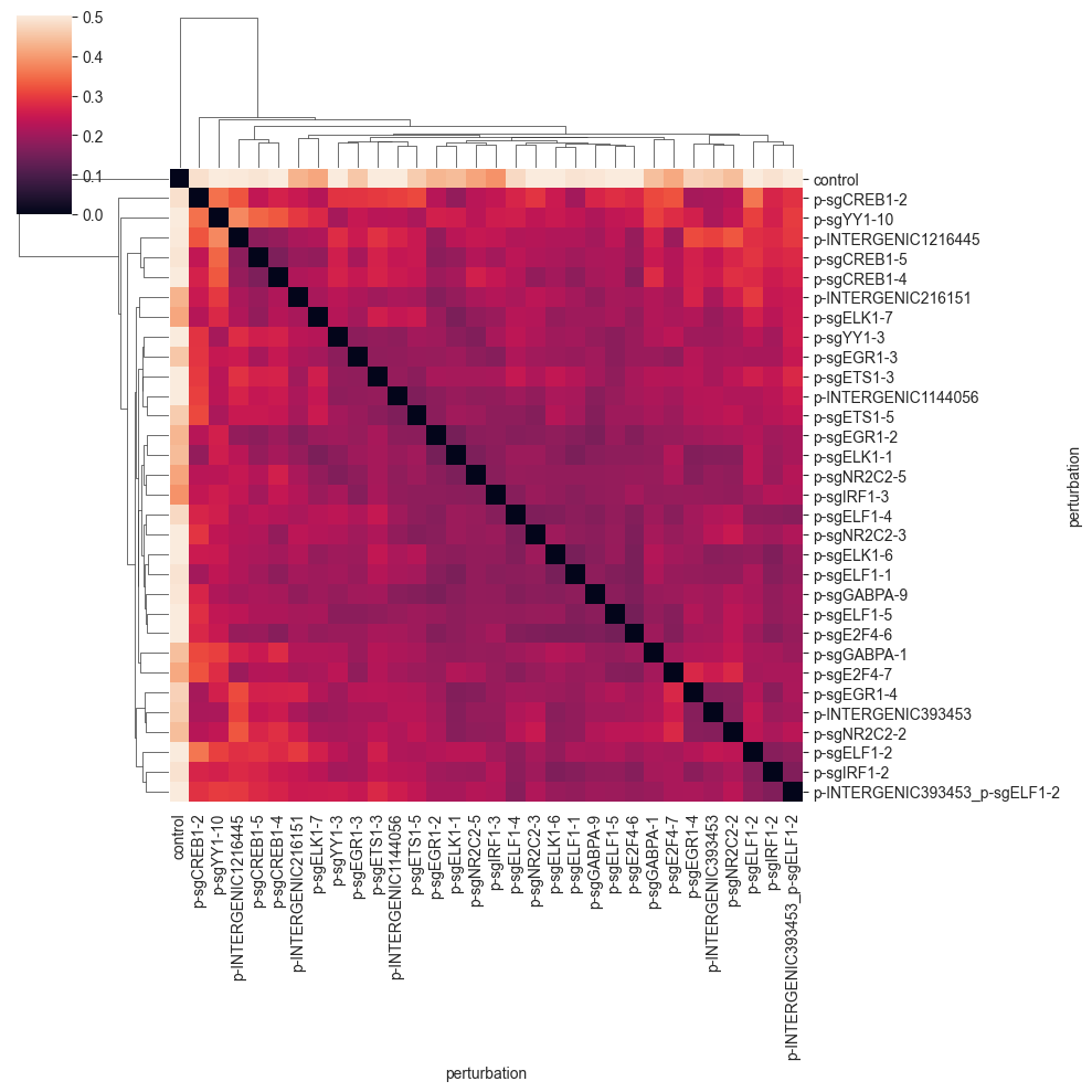
You can see that the E-distance is very small for the perturbations that are well-mixed, and increases for perturbations that are more separated. For example, the last three perturbations are quite similar and form a small cluster. You will see that the E-distance between guides targeting the same or similar genes is smaller on average.
Importantly, the control cells are quite far away from the perturbed cells; a good sign that the perturbations are working as expected. Also, the diagonal of the distance matrix is zero, as the distance of one group to itself should be zero for a proper distance metric.
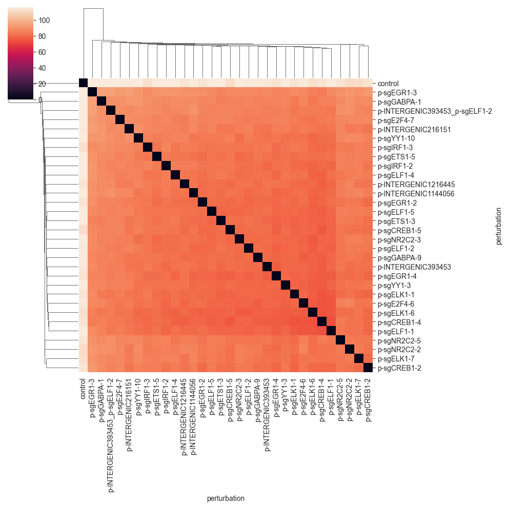
Euclidean Distance#
The Euclidean distance is defined as the euclidean distance between the average expression of the two groups. This average approximates bulk RNA-seq measurement of each group. While intuitive, it does not take into account the variability of the expression of the individual cells.
Nevertheless, the euclidean distance is widely used and can be useful as a comparison to other distances.
distance = pt.tl.Distance(metric="euclidean", obsm_key="X_pca")
df = distance.pairwise(adata, groupby=obs_key)
clustermap(df, robust=True, figsize=(10, 10))
plt.show()

The pairwise distance matrix shows bigger clusters of sometimes similar perturbations. While there is some similarity to the E-distance heatmap, you will see that different distances tend to represent the data in different ways.
Mean Pairwise Distance#
The mean pairwise distance is the mean of the pairwise distances between all cells in the two groups.
distance = pt.tl.Distance("mean_pairwise", obsm_key="X_pca")
df = distance.pairwise(adata, groupby=obs_key)
clustermap(df, robust=True, figsize=(10, 10))
plt.show()

Since the distance values are quite far away from 0, we do not see that much. We can get a better picture of the distances by changing the color range to start not from zero, but from the minimum non-zero distance value.:
values = np.ravel(df.values)
nonzero = values[values != 0]
vmin = np.min(nonzero)
clustermap(df, robust=True, figsize=(10, 10), vmin=vmin)
plt.show()

While we can see that the control cells are quite far away from the perturbed cells, the distance between the perturbations is not very informative.
Wasserstein Distance#
The Wasserstein distance is a distance between two probability distributions. It can be computed by solving an optimization problem called the optimal transport problem.
Intuitively, the Wasserstein distance measures the minimal amount of “work” needed to transform one distribution into the other. This is done by finding an optimal transport plan, which describes how to move mass (cells) from one group to another. The optimal transport plan is then the one that minimizes the overall sum of distances that mass (cells) have to be moved.
The optimal cost of this solution—the amount of “work” required—is then the Wasserstein distance. In this implementation, we solve the regularized optimal transport problem using the Sinkhorn algorithm (Cuturi, 2013).
distance = pt.tl.Distance("wasserstein", obsm_key="X_pca")
df = distance.pairwise(adata, groupby=obs_key)
clustermap(df, robust=True, figsize=(10, 10))
plt.show()
As was the case for the previous distance, the values are quite far away from 0, so we do not see that much. We can get a better picture of the distances by changing the color range:
values = np.ravel(df.values)
nonzero = values[values != 0]
vmin = np.min(nonzero)
clustermap(df, robust=True, figsize=(10, 10), vmin=vmin)
plt.show()
We can now more clearly see that there is a big cluster of perturbations that are comparably similar to each other. Also we can see that the last four perturbations in the matrix do not fit into this cluster.
MMD#
The maximum mean discrepancy (MMD) is a statistical distance. It is defined as the distance between embeddings of probability distributions in a reproducing kernel hilbert space. For more information on MMD for single cell biology see Lotfollahi et al. (2019). The specific implementation provided here is a simplified version of this code.
distance = pt.tl.Distance("mmd", obsm_key="X_pca")
df = distance.pairwise(adata, groupby=obs_key)
clustermap(df, robust=True, figsize=(10, 10))
plt.show()
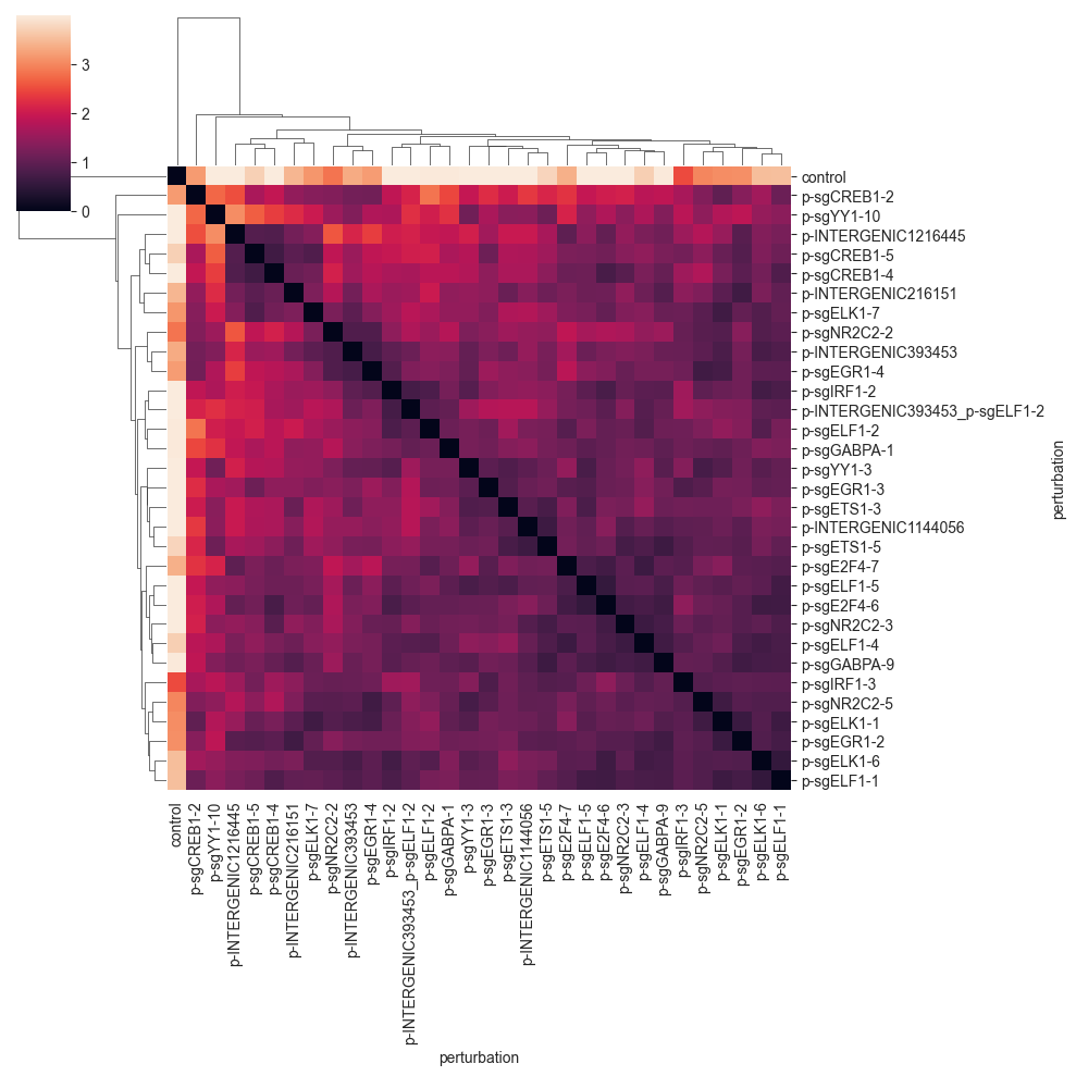
The MMD seems to group the perturbations in a similar way as the E-distance, but at a different scale. We can see the formation of a few cluster, which tend to have perturbations targeting the same or similar target.
Use Cases#
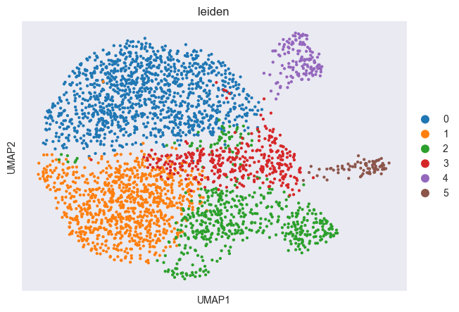
Let’s first cluster the data to get more clearly visible groups of cells.
sc.tl.leiden(adata, resolution=0.5)
sc.pl.scatter(adata, basis="umap", color="leiden")
Cluster Hierarchies#
distance = pt.tl.Distance("edistance", obsm_key="X_pca")
df = distance.pairwise(adata, groupby="leiden")
from scipy.cluster.hierarchy import dendrogram, linkage

Z = linkage(df, method="ward")
hierarchy = dendrogram(Z, labels=df.index, orientation="left", color_threshold=0)
plt.xlabel("E-distance")
plt.ylabel("Leiden clusters")
plt.gca().yaxis.set_label_position("right")
plt.show()
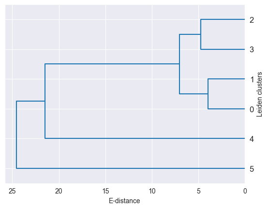
As demonstrated here, distances between single-cell groups can be used to build cluster hierarchies, which can be used to visualize the data in a more condensed way. For example, you can generate such a hierarchy for you cell type annotation.
Specific Cluster Similarities#
Let’s say we want to find out if cluster 4 is more similar to cluster 0 or to cluster 3. We can do this by computing the distance between cluster 4 and the other two as follows:
distance = pt.tl.Distance("edistance", obsm_key="X_pca")
df = distance.pairwise(adata[adata.obs.leiden.isin(["0", "3", "4"])], groupby="leiden")
df["4"][["0", "3"]].plot(kind="bar")
plt.xticks(rotation=0)
plt.ylabel("E-distance to cluster 4")
plt.show()
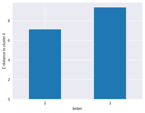
We can clearly see that cluster 4 is more similar to cluster 0 than to cluster 3, as it has a lower distance to the former.
Statistical Testing#
See the Distance Tests for an example.