
pertpy.tools.PyDESeq2#
- class PyDESeq2(adata, design, *, mask=None, layer=None, **kwargs)[source]#
Differential expression test using a PyDESeq2.
Attributes table#
Methods table#
|
Compare between groups in a specified column. |
|
Get a contrast vector representing a specific condition. |
|
Build a simple contrast for pairwise comparisons. |
|
Fit dds model using pydeseq2. |
|
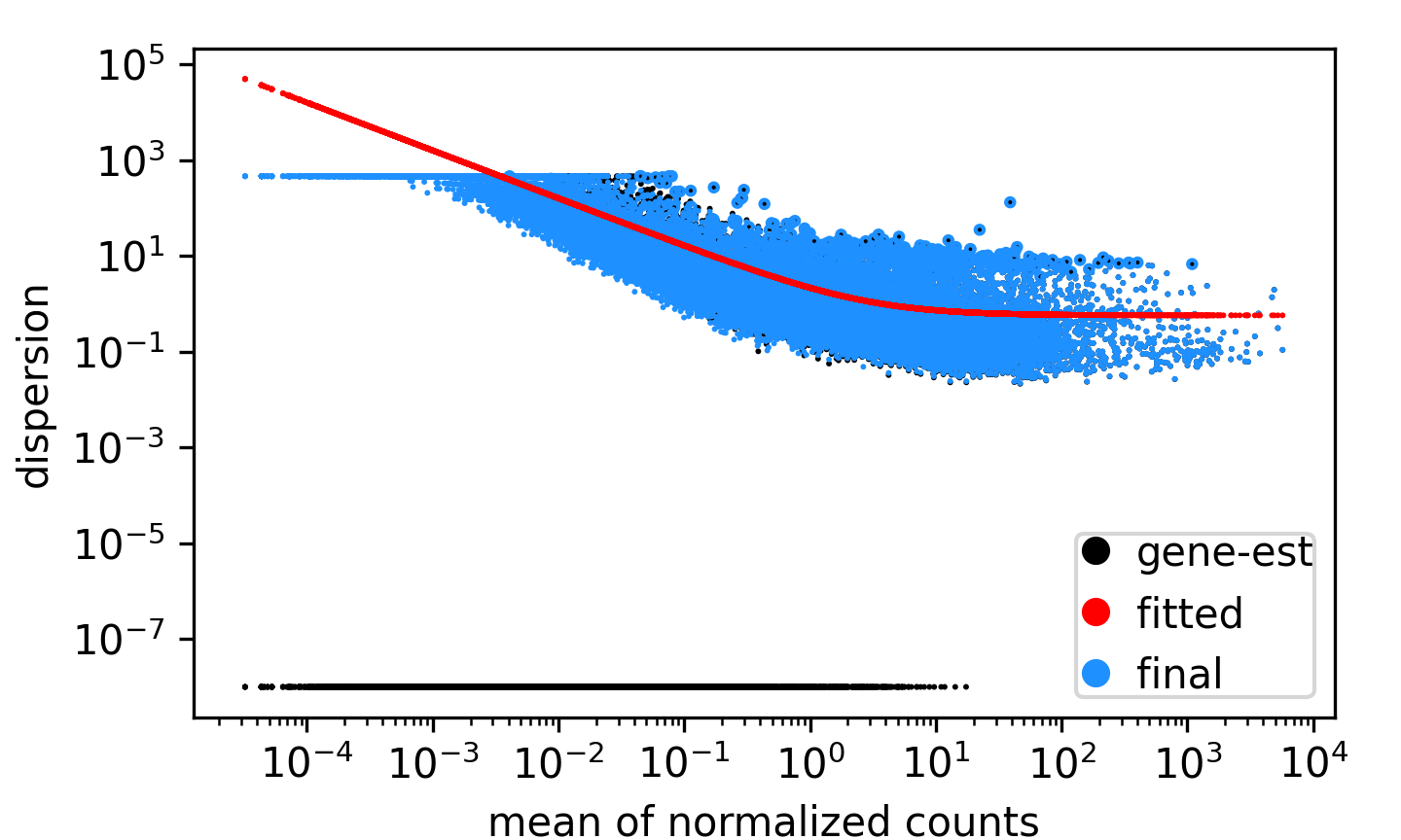
Plots per-gene dispersion estimates together with the fitted mean–dispersion relationship. |
|
Plot a metric from the results as a bar chart, optionally with additional information about paired samples in a scatter plot. |
|
Creates an MA plot of the mean expression against the log2 fold change. |
|
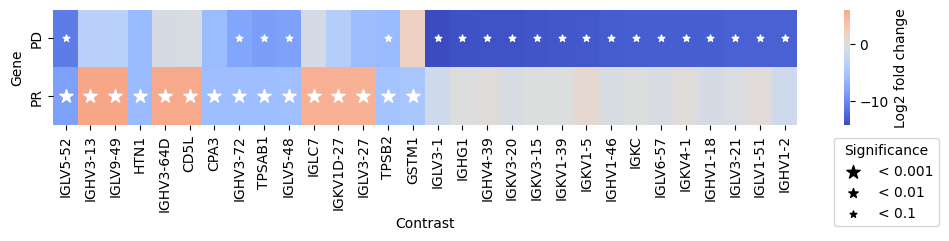
Plot a matrix of log2 fold changes from the results. |
|
Creates a pairwise expression plot from a Pandas DataFrame or Anndata. |
|
Creates a volcano plot from a pandas DataFrame or Anndata. |
|
Perform a comparison as specified in a contrast vector. |
|
Test against a reduced model. |
Attributes#
- PyDESeq2.data#
Get the data matrix from anndata this object was initalized with (X or layer).
- PyDESeq2.is_fitted#
Whether fit has been called on this model.
- PyDESeq2.variables#
Get the names of the variables used in the model definition.
Methods#
- classmethod PyDESeq2.compare_groups(adata, column, baseline, groups_to_compare, *, paired_by=None, mask=None, layer=None, fit_kwargs=mappingproxy({}), test_kwargs=mappingproxy({}))#
Compare between groups in a specified column.
- Parameters:
adata (
AnnData) – AnnData object.column (
str) – column in obs that contains the grouping information.baseline (
str) – baseline value (one category from variable).groups_to_compare (
str|Iterable[str]) – One or multiple categories from variable to compare against baseline.paired_by (
str|None, default:None) – Column from obs that contains information about paired sample (e.g. subject_id).mask (
Series|None, default:None) – Subset anndata by a boolean mask stored in this column in .obs before making any tests.layer (
str|None, default:None) – Use this layer instead of .X.fit_kwargs (default:
mappingproxy({})) – Additional fit options.test_kwargs (default:
mappingproxy({})) – Additional test options.
- Returns:
Pandas dataframe with results ordered by significance. If multiple comparisons were performed this is indicated in an additional column.
Examples
>>> # Example with EdgeR
>>> import pertpy as pt
>>> adata = pt.dt.zhang_2021()
>>> adata.layers["counts"] = adata.X.copy()
>>> ps = pt.tl.PseudobulkSpace()
>>> pdata = ps.compute(adata, target_col="Patient", groups_col="Cluster", layer_key="counts", mode="sum")
>>> edgr = pt.tl.EdgeR(pdata, design="~Efficacy+Treatment")
>>> res_df = edgr.compare_groups(pdata, column="Efficacy", baseline="SD", groups_to_compare=["PR", "PD"])
- PyDESeq2.cond(**kwargs)#
Get a contrast vector representing a specific condition.
- Parameters:
**kwargs – column/value pairs.
- Returns:
A contrast vector that aligns to the columns of the design matrix.
- PyDESeq2.contrast(*args, **kwargs)#
Build a simple contrast for pairwise comparisons.
- Parameters:
column – column in adata.obs to test on.
baseline – baseline category (denominator).
group_to_compare – category to compare against baseline (nominator).
- Returns:
Numeric contrast vector.
- PyDESeq2.fit(**kwargs)[source]#
Fit dds model using pydeseq2.
Note: this creates its own AnnData object for downstream processing.
- Parameters:
**kwargs – Keyword arguments specific to DeseqDataSet(), except for n_cpus which will use all available CPUs minus one if the argument is not passed.
- Return type:
- PyDESeq2.plot_disp_ests(*, ymin=None, cv=False, gene_col='black', fit_col='red', final_col='dodgerblue', legend=True, xlabel=None, ylabel=None, log='xy', point_size=0.45, return_fig=False, **kwargs)[source]#
Plots per-gene dispersion estimates together with the fitted mean–dispersion relationship.
- Parameters:
ymin (
float|None, default:None) – Lower bound for plotted values. Points below this threshold are drawn at ymin using triangle markers.cv (
bool, default:False) – If True, plot the square root of dispersion (coefficient of variation) instead of dispersion.gene_col (
str, default:'black') – Color for gene-wise dispersion estimates.fit_col (
str, default:'red') – Color for fitted dispersion trend.final_col (
str, default:'dodgerblue') – Color for final dispersion estimates used for testing.legend (
bool, default:True) – Whether to draw a legend.xlabel (
str|None, default:None) – Label for the x-axis (default: “mean of normalized counts”).ylabel (
str|None, default:None) – Label for the y-axis (default: “dispersion” or “coefficient of variation”).log (
str, default:'xy') – Axis scaling. “x”, “y”, or “xy” for log scaling.point_size (
float, default:0.45) – Scaling factor for point sizes.return_fig (
bool, default:False) – if True, returns figure of the plot, that can be used for saving.**kwargs – Additional arguments for ax.scatter.
- Return type:
- Returns:
If return_fig is True, returns the figure, otherwise None.
Examples
>>> import pertpy as pt
>>> import decoupler as dc
>>> adata = pt.dt.zhang_2021()
>>> adata = adata[adata.obs["Origin"] == "t", :].copy()
>>> adata.layers["counts"] = adata.X.copy()
>>> pdata = dc.pp.pseudobulk(adata, sample_col="Patient", groups_col="Cluster", layer="counts", mode="sum")
>>> dc.pp.filter_samples(pdata, inplace=True)
>>> pds2 = pt.tl.PyDESeq2(pdata, design="~Efficacy+Treatment")
>>> pds2.fit()
>>> pds2.plot_disp_ests(point_size=0.1)
- Preview:
- PyDESeq2.plot_fold_change(results_df, *, var_names=None, n_top_vars=15, padj_threshold=0.01, padj_col='adj_p_value', log2fc_col='log_fc', symbol_col='variable', y_label='Log2 fold change', figsize=(10, 5), return_fig=False, **barplot_kwargs)#
Plot a metric from the results as a bar chart, optionally with additional information about paired samples in a scatter plot.
- Parameters:
results_df (
DataFrame) – DataFrame with results from DE analysis.var_names (
Sequence[str] |None, default:None) – Variables to plot. If None, the top n_top_vars variables based on the log2 fold change are plotted.n_top_vars (
int, default:15) – Number of top variables to plot. The top and bottom n_top_vars variables are plotted, respectively.padj_threshold (
float, default:0.01) – Only variables with adjusted p-values below this threshold are included in the plot.padj_col (
str, default:'adj_p_value') – Column name of adjusted p-values.log2fc_col (
str, default:'log_fc') – Column name of log2 Fold-Change values.symbol_col (
str, default:'variable') – Column name of gene IDs.y_label (
str, default:'Log2 fold change') – Label for the y-axis.figsize (
tuple[int,int], default:(10, 5)) – Size of the figure.return_fig (
bool, default:False) – if True, returns figure of the plot, that can be used for saving.**barplot_kwargs – Additional arguments for seaborn.barplot.
- Return type:
- Returns:
If return_fig is True, returns the figure, otherwise None.
Examples
>>> # Example with EdgeR
>>> import pertpy as pt
>>> adata = pt.dt.zhang_2021()
>>> adata.layers["counts"] = adata.X.copy()
>>> ps = pt.tl.PseudobulkSpace()
>>> pdata = ps.compute(adata, target_col="Patient", groups_col="Cluster", layer_key="counts", mode="sum")
>>> edgr = pt.tl.EdgeR(pdata, design="~Efficacy+Treatment")
>>> edgr.fit()
>>> res_df = edgr.test_contrasts(
...     edgr.contrast(column="Treatment", baseline="Chemo", group_to_compare="Anti-PD-L1+Chemo")
... )
>>> edgr.plot_fold_change(res_df)
- Preview:

- PyDESeq2.plot_ma(results_df, *, mean_col=None, log2fc_col='log_fc', padj_col='adj_p_value', padj_threshold=0.05, log2fc_threshold=0.0, log_x=None, colors=('lightgray', '#D62728'), x_label=None, y_label='Log2 fold change', figsize=(5, 5), return_fig=False, **kwargs)#
Creates an MA plot of the mean expression against the log2 fold change.
The pertpy equivalent of edgeR’s plotSmear and DESeq2’s plotMA. Every variable is one point, so the plot shows how the fold change depends on expression strength and which variables the test called significant.
- Parameters:
results_df (
DataFrame) – DataFrame with results from DE analysis.mean_col (
str|None, default:None) – Column name of the mean expression. If None, PyDESeq2’s baseMean and edgeR’s logCPM are detected automatically.log2fc_col (
str, default:'log_fc') – Column name of log2 Fold-Change values.padj_col (
str, default:'adj_p_value') – Column name of adjusted p-values.padj_threshold (
float, default:0.05) – Variables with an adjusted p-value below this threshold are highlighted as significant.log2fc_threshold (
float, default:0.0) – Variables must additionally exceed this absolute log2 fold change to be highlighted. The thresholds are drawn as dashed lines if it is not zero.log_x (
bool|None, default:None) – Whether to log-scale the x-axis. If None, it is scaled for mean columns on a linear scale such as baseMean but not for those already on a log scale such as logCPM.colors (
Sequence[str], default:('lightgray', '#D62728')) – Colors for [non-significant, significant] variables.y_label (
str, default:'Log2 fold change') – Label for the y-axis.figsize (
tuple[int,int], default:(5, 5)) – Size of the figure.return_fig (
bool, default:False) – if True, returns figure of the plot, that can be used for saving.**kwargs – Additional arguments for seaborn.scatterplot.
- Return type:
- Returns:
If return_fig is True, returns the figure, otherwise None.
Examples
>>> # Example with EdgeR
>>> import pertpy as pt
>>> adata = pt.dt.zhang_2021()
>>> adata.layers["counts"] = adata.X.copy()
>>> ps = pt.tl.PseudobulkSpace()
>>> pdata = ps.compute(adata, target_col="Patient", groups_col="Cluster", layer_key="counts", mode="sum")
>>> edgr = pt.tl.EdgeR(pdata, design="~Efficacy+Treatment")
>>> edgr.fit()
>>> res_df = edgr.test_contrasts(
...     edgr.contrast(column="Treatment", baseline="Chemo", group_to_compare="Anti-PD-L1+Chemo")
... )
>>> edgr.plot_ma(res_df)
- Preview:

- PyDESeq2.plot_multicomparison_fc(results_df, *, n_top_vars=15, contrast_col='contrast', log2fc_col='log_fc', pvalue_col='adj_p_value', symbol_col='variable', marker_size=100, figsize=(10, 2), x_label='Contrast', y_label='Gene', return_fig=False, **heatmap_kwargs)#
Plot a matrix of log2 fold changes from the results.
- Parameters:
results_df (
DataFrame) – DataFrame with results from DE analysis.n_top_vars (default:
15) – Number of top variables to plot per group.contrast_col (
str, default:'contrast') – Column in results_df containing information about the contrast.log2fc_col (
str, default:'log_fc') – Column in results_df containing the log2 fold change.pvalue_col (
str, default:'adj_p_value') – Column in results_df containing the p-value. Can be used to switch between adjusted and unadjusted p-values.symbol_col (
str, default:'variable') – Column in results_df containing the gene symbol.marker_size (
int, default:100) – Size of the biggest marker for significant variables.figsize (
tuple[int,int], default:(10, 2)) – Size of the figure.x_label (
str, default:'Contrast') – Label for the x-axis.y_label (
str, default:'Gene') – Label for the y-axis.return_fig (
bool, default:False) – if True, returns figure of the plot, that can be used for saving.**heatmap_kwargs – Additional arguments for seaborn.heatmap.
- Return type:
- Returns:
If return_fig is True, returns the figure, otherwise None.
Examples
>>> # Example with EdgeR
>>> import pertpy as pt
>>> adata = pt.dt.zhang_2021()
>>> adata.layers["counts"] = adata.X.copy()
>>> ps = pt.tl.PseudobulkSpace()
>>> pdata = ps.compute(adata, target_col="Patient", groups_col="Cluster", layer_key="counts", mode="sum")
>>> edgr = pt.tl.EdgeR(pdata, design="~Efficacy+Treatment")
>>> res_df = edgr.compare_groups(pdata, column="Efficacy", baseline="SD", groups_to_compare=["PR", "PD"])
>>> edgr.plot_multicomparison_fc(res_df)
- Preview:
- PyDESeq2.plot_paired(adata, results_df, groupby, pairedby, *, var_names=None, n_top_vars=15, layer=None, pvalue_col='adj_p_value', symbol_col='variable', n_cols=4, panel_size=(5, 5), show_legend=True, size=10, y_label='expression', pvalue_template=<function MethodBase.<lambda>>, boxplot_properties=None, palette=None, return_fig=False)#
Creates a pairwise expression plot from a Pandas DataFrame or Anndata.
Visualizes a panel of paired scatterplots per variable.
- Parameters:
adata (
AnnData) – AnnData object, can be pseudobulked.results_df (
DataFrame) – DataFrame with results from a differential expression test.groupby (
str) – .obs column containing the grouping. Must contain exactly two different values.pairedby (
str) – .obs column containing the pairing (e.g. “patient_id”). If None, an independent t-test is performed.var_names (
Sequence[str] |None, default:None) – Variables to plot.n_top_vars (
int, default:15) – Number of top variables to plot.layer (
str|None, default:None) – Layer to use for plotting.pvalue_col (
str, default:'adj_p_value') – Column name of the p values.symbol_col (
str, default:'variable') – Column name of gene IDs.n_cols (
int, default:4) – Number of columns in the plot.panel_size (
tuple[int,int], default:(5, 5)) – Size of each panel.show_legend (
bool, default:True) – Whether to show the legend.size (
int, default:10) – Size of the points.y_label (
str, default:'expression') – Label for the y-axis.pvalue_template (default:
<function MethodBase.<lambda> at 0x751ae1a66ca0>) – Template for the p-value string displayed in the title of each panel.boxplot_properties (default:
None) – Additional properties for the boxplot, passed to seaborn.boxplot.palette (default:
None) – Color palette for the line- and stripplot.return_fig (
bool, default:False) – if True, returns figure of the plot, that can be used for saving.
- Return type:
- Returns:
If return_fig is True, returns the figure, otherwise None.
Examples
>>> # Example with EdgeR
>>> import pertpy as pt
>>> adata = pt.dt.zhang_2021()
>>> adata.layers["counts"] = adata.X.copy()
>>> ps = pt.tl.PseudobulkSpace()
>>> pdata = ps.compute(adata, target_col="Patient", groups_col="Cluster", layer_key="counts", mode="sum")
>>> edgr = pt.tl.EdgeR(pdata, design="~Efficacy+Treatment")
>>> edgr.fit()
>>> res_df = edgr.test_contrasts(
...     edgr.contrast(column="Treatment", baseline="Chemo", group_to_compare="Anti-PD-L1+Chemo")
... )
>>> edgr.plot_paired(pdata, results_df=res_df, n_top_vars=8, groupby="Treatment", pairedby="Efficacy")
- Preview:

- PyDESeq2.plot_volcano(data, *, log2fc_threshold=0.75, padj_threshold=0.05, log2fc_col='log_fc', padj_col='adj_p_value', symbol_col='variable', to_label=5, s_curve=False, colors=None, varm_key=None, color_dict=None, shape_dict=None, size_col=None, fontsize=10, top_right_frame=False, figsize=(5, 5), legend_pos=(1.6, 1), point_sizes=(15, 150), shapes=None, shape_order=None, x_label=None, y_label=None, return_fig=False, log2fc_thresh=None, pval_thresh=None, pvalue_col=None, **kwargs)#
Creates a volcano plot from a pandas DataFrame or Anndata.
- Parameters:
log2fc_threshold (
float, default:0.75) – Threshold for log2 fold change significance.padj_threshold (
float, default:0.05) – Adjusted p-values for significance.log2fc_col (
str, default:'log_fc') – Column name of log2 Fold-Change values.padj_col (
str, default:'adj_p_value') – Column name of adjusted p-values.symbol_col (
str, default:'variable') – Column name of gene IDs.varm_key (
str|None, default:None) – Key in Anndata.varm slot to use for plotting if an Anndata object was passed.size_col (
str|None, default:None) – Column name to size points by.point_sizes (
tuple[int,int], default:(15, 150)) – Lower and upper bounds of point sizes.to_label (
int|list[str], default:5) – Number of top genes or list of genes to label.s_curve (
bool, default:False) – Whether to use a reciprocal threshold for up and down gene determination.color_dict (
dict[str,list[str]] |None, default:None) – Dictionary for coloring dots by categories.shape_dict (
dict[str,list[str]] |None, default:None) – Dictionary for shaping dots by categories.fontsize (
int, default:10) – Size of gene labels.colors (
list[str] |None, default:None) – Colors for [non-DE, up, down] genes. Defaults to [‘gray’, ‘#D62728’, ‘#1F77B4’].top_right_frame (
bool, default:False) – Whether to show the top and right frame of the plot.figsize (
tuple[int,int], default:(5, 5)) – Size of the figure.legend_pos (
tuple[float,float], default:(1.6, 1)) – Position of the legend as determined by matplotlib.shapes (
list[str] |None, default:None) – List of matplotlib marker ids.shape_order (
list[str] |None, default:None) – Order of categories for shapes.log2fc_thresh (
float|None, default:None) – Deprecated and will be removed in a future release. Use log2fc_threshold.pval_thresh (
float|None, default:None) – Deprecated and will be removed in a future release. Use padj_threshold.pvalue_col (
str|None, default:None) – Deprecated and will be removed in a future release. Use padj_col.return_fig (
bool, default:False) – if True, returns figure of the plot, that can be used for saving.**kwargs – Additional arguments for seaborn.scatterplot.
- Return type:
- Returns:
If return_fig is True, returns the figure, otherwise None.
Examples
>>> # Example with EdgeR
>>> import pertpy as pt
>>> adata = pt.dt.zhang_2021()
>>> adata.layers["counts"] = adata.X.copy()
>>> ps = pt.tl.PseudobulkSpace()
>>> pdata = ps.compute(adata, target_col="Patient", groups_col="Cluster", layer_key="counts", mode="sum")
>>> edgr = pt.tl.EdgeR(pdata, design="~Efficacy+Treatment")
>>> edgr.fit()
>>> res_df = edgr.test_contrasts(
...     edgr.contrast(column="Treatment", baseline="Chemo", group_to_compare="Anti-PD-L1+Chemo")
... )
>>> edgr.plot_volcano(res_df, log2fc_threshold=0)
- Preview:

- PyDESeq2.test_contrasts(contrasts, **kwargs)#
Perform a comparison as specified in a contrast vector.
- PyDESeq2.test_reduced(modelB)#
Test against a reduced model.
- Parameters:
modelB – the reduced model against which to test.
Example
>>> import pertpy as pt
>>> modelA = Model().fit()
>>> modelB = Model().fit()
>>> modelA.test_reduced(modelB)